Visualizing Convergence in Probability and the Law of Large Numbers
How to visualize convergence in probability and the weak law of large numbers directly and honestly
Convergence in probability is fundamental to statistical inference. It underpins most large-sample approximations, while consistency is a basic requirement for any sensible estimator. While the formal definition is simple, building an intuitive understanding is a bit challenging. This post explores two “honest” ways to visualize convergence in probability, using the law of large numbers as an example.
- Reminder: Convergence in Probability and the Weak Law of Large Numbers
- The “Usual” Ways
- Two Better Ways
If math is messed up, reload the page so that MathJax has another go.
Reminder: Convergence in Probability and the Weak Law of Large Numbers
To start, recall that a sequence \(X_1, X_2, \dots\) converges in probability to \(X\) if for every \(\varepsilon>0\) the probability of \(X_n\) deviating from \(X\) by more than \(\varepsilon\) tends to zero as \(n\to\infty\) \[P(|X_n-X|>\varepsilon) \to 0\]
The simplest weak law of large numbers simply says the following. If \(X_1, X_2, ...\) are independently and identically distributed with a finite mean \(\mathbb{E}[X_i]\), then the average of these variables converges to \(\mathbb{E}[X_i]\) precisely in the above sense: for any \(\varepsilon>0\) it holds that \[P(|\bar{X}-\mathbb{E}[X_i]|>\varepsilon) \to 0\]
The “Usual” Ways
A common way to visualize the law of large numbers is to plot the path of the sample mean as the sample size increases. For example:
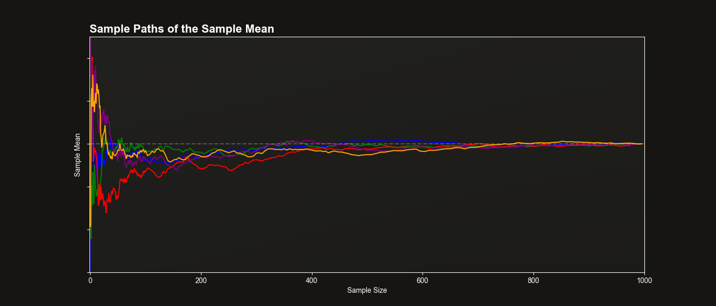
The plot above shows several trajectories of the sample mean across increasing sample sizes. The horizontal dashed line represents the true population mean.
While this visualization has some appeal, it actually at best illustrates almost sure convergence. Almost sure convergence is a stronger and more technical concept that usually only makes sense after some real analysis, but not in a first course in probability or statistics. More importantly, the above plot doesn’t connect visually to the definition involving probabilities.
Two Better Ways
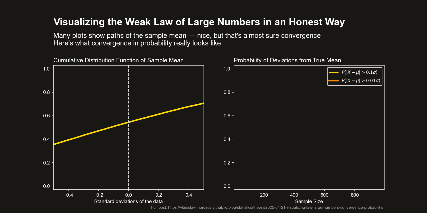
Unfortunately, there is no way around it — convergence in probability has to do with convergence of, well, probabilities. The best approach is then to honestly visualize such probabilities.
Here are two proposals, shown in the animated plot on top of the page.
Direct Visualization of Probabilities (Right Panel)
Choose a few values of \(\varepsilon\) and plot the probability that the sample mean deviates from the population mean by more than \(\varepsilon\) as a function of sample size. This aligns exactly with the definition of convergence in probability and shows how these deviation probabilities shrink.
CDF convergence (left panel)
Plot the empirical cumulative distribution function (CDF) of the sample mean. As the sample size increases, this CDF collapses to the CDF of the constant \(\mathbb{E}[X_i]\) — 0 below that value, 1 starting from \(\mathbb{E}[X_i]\). This shows convergence in distribution, which (when the limit is a constant) is equivalent to convergence in probability. A nice feature is that this approach visualizes all the probabilities at the same time.
This second method also improves on another common visualization: plotting histograms or densities of the sample mean across replications. While intuitive, convergence of histograms/densities is actually convergence in total variation, a much stronger notion that’s not quite relevant here. Using the CDF instead keeps the focus on the core idea.